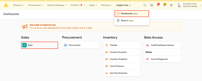
You can find the new Dashboard in the 'Insights Hub', by clicking 'Dashboards' and then click 'Sales'.
Don't worry! If you liked the old sales dashboard better, or you prefer to stick to what you know, you can still access the old sales dashboard by clicking on the 'Bring me to the old Sales Dashboard'-button highlighted below.
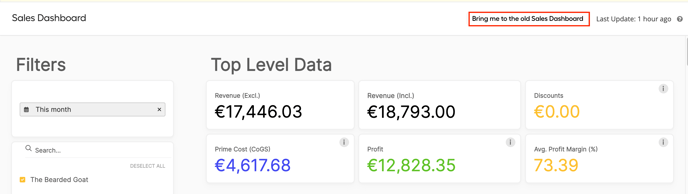
Filters
At the top left panel, you can set your filters. You can choose for which timeframe you'd like to receive sales insights, for which outlet(s) and for which PoS categories. The filters you select will apply immediately on all the displayed charts and graphs.
Top Level Data
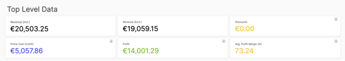
- Revenue: This is your total revenue for the selected timeframe. We display it with and without the VAT-percentage.
- Discounts: If discounts were entered in the POS system, the total amount will be displayed here.
- Prime Cost (CoGS): This number is based on the theoretical food cost and production cost of your sold (and linked) recipes.
- Profit: Profit here is calculated as Revenue (excl. VAT) minus Prime Cost (COGS).
- Average Profit Margin (%): This represents the weighted (by Revenue) average profit margin of all covered Revenue. This is normally the most accurate representation.
PoS Connection Health Status
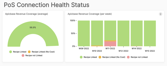
These charts give you a quick insight into the number of your PLU's that are linked to Apicbase recipes. It should always be the goal to aim for 100% coverage. If sales are happening for PLU's that are not linked to Apicbase recipes (or when they are linked but the recipe incorrectly has no cost), Apicbase can not calculate the prime cost of the sold recipe and as a result your sales data will be distorted.
Tip: The Apicbase Assistant can help you in reaching full coverage, as this tool will show you which items are being sold without a link to a recipe. Click here to learn more about the Apicbase assistant.
Revenue Data
Here you'll see two graphs:
- The first graph (Revenue and profit per day) shows the following variables over the selected period. (Y-axis: indicator in the chosen currency, X-axis: dates of the selected period, outlet(s) and POS Categories). Clicking on one of the variables will hide/show them as a coloured line the graph.
- Revenue (incl.)
- Revenue (excl.)
- Profit
- Prime Cost
- The second graph (Revenue per Outlet per Month) is a bar graph that clusters your Revenue per month per outlet.
Profit Data
Under this header you will find all kinds of breakdowns of your profit.
- Revenue per Outlet:
This gives you a breakdown of the ratio prime cost versus profit per outlet. - Revenue and Profit Margin per PoS Category:
Over all selected outlets, we display here which of your PoS Categories have the highest revenue, profit, profit margin and prime cost. - Profit Margin Evolution (Weekly):
This chart shows you how your profit margin evolved over time. Note that all entries with a profit margin of 0 or less or 100 were excluded in calculating the average. - Category-level profit distribution:
This is a variation on the second graph, only taking profit per PoS category into account. - High Level Profit Breakdown:
This chart has 3 circles.- The inner circle shows you how your profit is distributed over your different locations.
- The middle circle shows you how your profit is distributed over your PoS-categories.
- The outer circle breaks down your profit on the smallest level, per sales item.
- Item Level Profit Distribution:
This is a breakdown on the smallest level as well, only displayed in a different way. Your best selling sales items will have the biggest circles.
Detailed Tables
In the detailed tables you will find all the available information in detail, over the selected period, outlets and PoS Categories. There are 2 tables:
- Sales Mix Detail
- Name (POS): Name of the sales item in the PoS-system.
- PLU: PLU-code of the sales item.
- Name (Recipe): Name of the linked recipe in Apicbase.
- Quantity: Amount sold.
- Revenue (Excl.)
- Prime Cost: Theoretical food cost + production cost.
- Profit: Revenue (excl.) minus prime cost on the total amount of sales for this item.
- Discount
- Profit Margin (%): Percentage of the revenue that is profit .
- Individual Ticket Line Data
This table shows every individual sales ticket, when it was sold, in which outlet, the PoS category, revenue, VAT%, Prime Cost, Profit and Prodit Margin.
Tip: All of the graphs and charts on this dashboard are available for export (.png, .xlxs, .csv).
You can find the export button by hovering over a chart and clicking the ![]() - symbol.
- symbol.