How can I get an oversight of my orders in a dashboard?
Apicbase carries a lot of interesting data on your orders. The Supplier dashboard gives you many charts that give you the details on your orders at a glance. Read this article to learn more.
Follow these steps below to use the supplier dashboard:
- To get to the supplier dashboard, click "Procurement">"Suppliers" and click on "Supplier Dashboard" in the toolbar.
- First select date range, the interval, the outlet(s) and the supplier(s) you want to see the charts for.
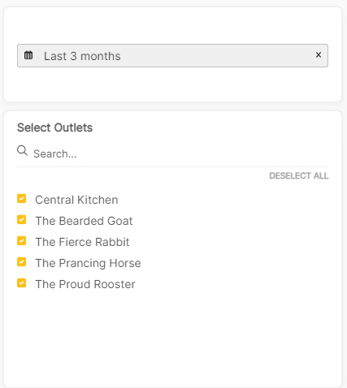
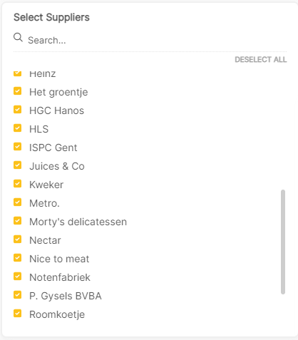
- Once you selected your filters the charts will begin to appear. You can always hover over a block in the chart to see the actual number or value. You can also click on a category in the graph Legend the take it out off the graph:
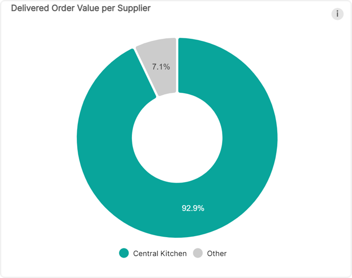
- Delivered Order Value per Supplier: here you see the distribution of the value of all your delivered orders per supplier in a donut chart.
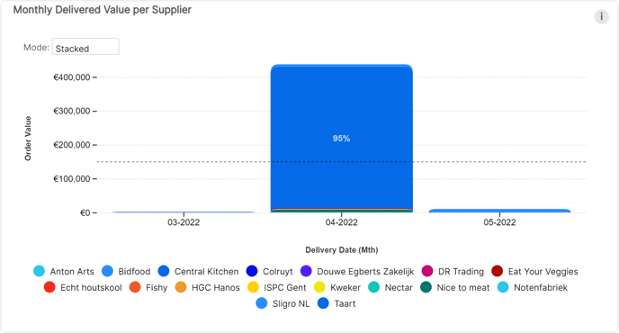
- Monthly Delivered Value per Supplier: This bar chart shows you the total value of delivered orders per supplier for the current and previous month. In the drop-down menu above you can select other settings for the chart and hovering over the bars will show you additional information.
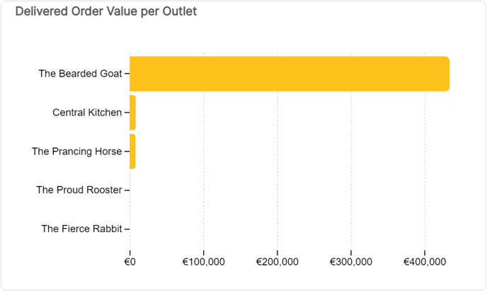
- Delivered Order Value per Outlet is a chart that shows you the total Delivered Order Value per outlet over the entire period you selected at the top.
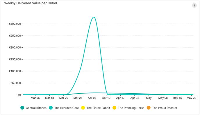
- Weekly Delivered Value per Outlet shows you a line chart that shows you the delivered Value per Outlet for a selected interval.
- Delivered Order Value per Supplier per Outlet is a table that contains all the data used to create the dashboard. You can export this table with Excel if you want to perform a deep dive on your data.
- Delivered Order Value per Supplier: here you see the distribution of the value of all your delivered orders per supplier in a donut chart.
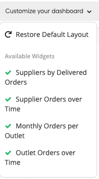
- As with our main Dashboard, you can drag and drop the graphs to organize them as you want. You can also click on "Customize your dashboard" and select which graphs you want to display.
