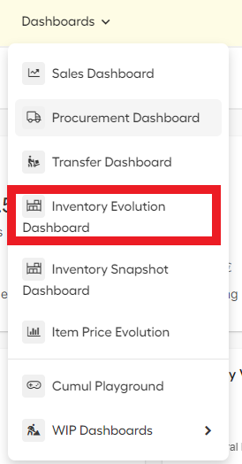
- To go to the inventory dashboard click on "Dashboards" in the upper menu and click on "Inventory Evolution Dashboard".
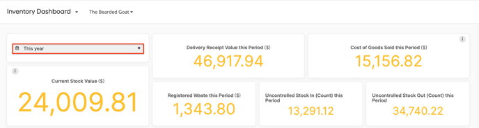
- Select the outlet for which you want to see the data
- In the upper lefthand corner, you can select the period you want.
- You can select a predefined period on the left or a specific date range on the right.
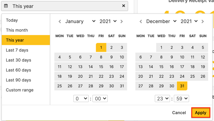
- You can select a predefined period on the left or a specific date range on the right.
- You can check the following key figures on your inventory for the selected outlet and period.
- Delivery receipt value this period: The value of all the orders that were registered as received in Apicbase during the selected period.
- Cost of Goods Sold this period: The value of the items sold during the selected period.
- Registered waste this Period: The value of all the stock items that were wasted during the selected period.
- Uncontrolled stock in (Count) this Period: This is the total value of the stock items that had more stock when they were counted than the theoretical stock was in Apicbase at the time.
- Uncontrolled stock out (Count) this Period: This is the total value of the stock items that had less stock when they were counted, than the theoretical stock was in Apicbase at the time.
-
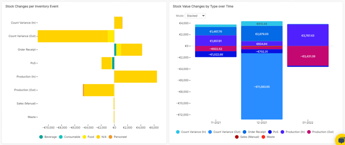
- Stock Change value by inventory event over time: This graph shows you the value of each inventory event per month of the selected period. You can choose between three modes:
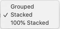
- Stacked: You get one bar per month, each inventory event as a part of the bar. The events that deplete stock are below the O line (Waste, Sales, Transfer out, Create out, Uncontrolled), the events that add to the stock are above the 0 line (Order, Create in, Transfer in, Uncontrolled).
- 100% stacked: You get one bar per month, each inventory even is a block of the bar.
- Grouped: you see a bar per inventory event for each month
- Stock changes per inventory event: This is a block diagram that shows each inventory event's value in a block that is a relative part of the total.
- Stock Change value by inventory event over time: This graph shows you the value of each inventory event per month of the selected period. You can choose between three modes:
When you have over one of the bars or blocks in the graph, you get more details like the value, event, percentage...