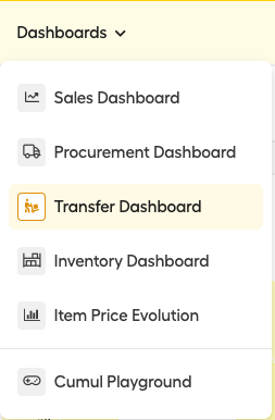
To go to the transfer dashboard:
- Click on "Dashboards" in the upper menu and select the "Transfer Dashboard".
On the dashboard, you have a lot of very powerful graphs and data.
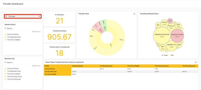
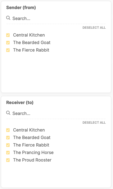
To get started, filter on the right data:
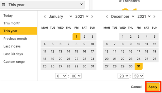
- Set the period for which you want to see the transfer data for. You can choose between pre-defined periods or a custom one.
- Filter on the sending and receiving outlets you want to analyze the transfer data of.
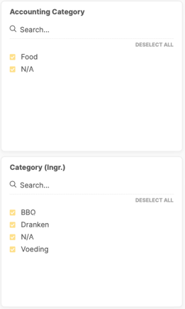
- Further, you can filter on which transferred items you want to:
- Accounting category
- Category (only ingredients)
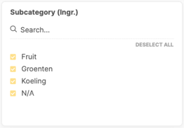
- Subcategory (only ingredients)
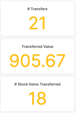
Now you can check the data on the selection you have made set.
- The first three numbers show:
- The number of transfers made.
- The total transferred value.
- The number of Stock Items Transferred.
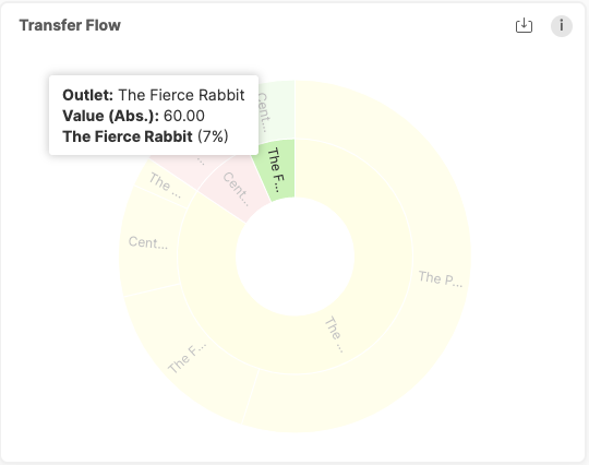
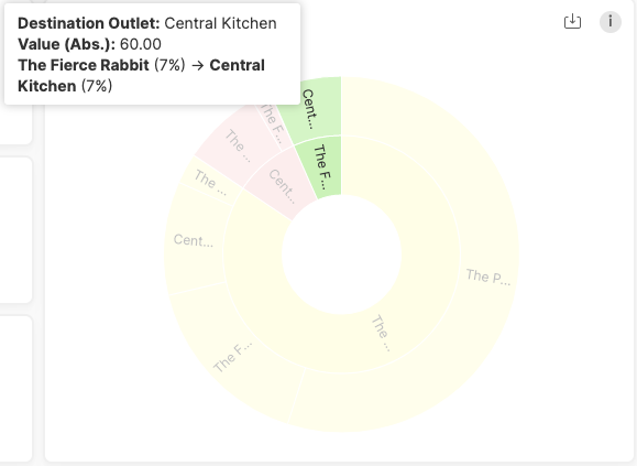
- The Transfer flow graph gives you in one graf an oversight of the value that is transferred between outlets.
- The inner-circle represents the sending outlets and shows the value that is transferred out of this outlet.
-
- The outer circle represents the receiving outlets and shows the value that is received from the corresponding outlet in the inner circle.
- When you hover over a block in the graph, you get
- The exact name of the outlet it represents (and the sending outlet if you check the outer circle).
- The value that was transferred.
- The total percentage it represents from the ring it is in.
- Example:
- Inner circle: Outlet The Fierce Rabbit transferred for 60€ out of the outlet. This was good for 7% of all the transfers that went out of the selected outlets.
- Outer circle: The Central Kitchen got 60€ worth of items transferred into the stock from "The Fierce Rabbit" outlet. This means that all the transfers going out of the "The Fierce Rabbit" went to the "Central Kitchen" outlet. This was good for 7% of the total value transferred into outlets.
- Inner circle: Outlet The Fierce Rabbit transferred for 60€ out of the outlet. This was good for 7% of all the transfers that went out of the selected outlets.
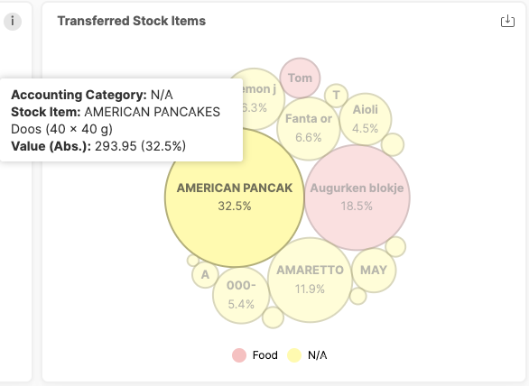
- The transferred stock items bubble graph shows the total transferred value for each item. The bigger the bubble the higher the value that was transferred with this item.
- When you have over a bubble, you see:
- The exact name of the stock item that was transferred.
- The value that was transferred with this item.
- The percentage of the total transferred value this item represents.
- Example: The American Pancakes 40x40g has been transferred for a value of 295.95€ during the selected period. This was good for 32.5% of all the transfers.
- When you have over a bubble, you see:
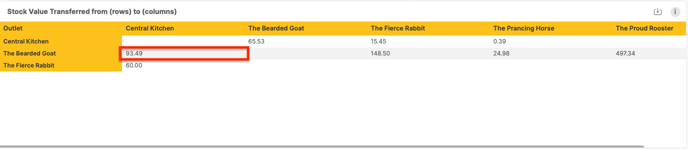
- Stock Value transferred from (rows) to (columns) shows the value that is transferred from the outlet in the row to the corresponding outlet in the intersecting column.
- In this example, we see that a value of 93.49€ was transferred between "The Bearded Goat" and "Central Kitchen".
- In this example, we see that a value of 93.49€ was transferred between "The Bearded Goat" and "Central Kitchen".
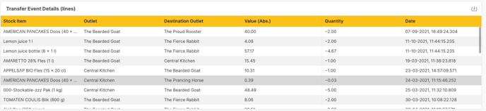
- Transfer Event Details show every transfer event that was registered showing the sending outlet, the destination outlet, the value, quantity, and the date of the event.
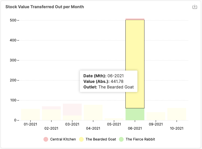
- Stock Value Transferred Out Per Month: This graph shows the total value that is transferred out of the outlets. Every block represents a specific outlet. If you hover over the block you get more details.
- In this example, we can see that in June 2021 for 441.78€ was transferred out of "The Bearded Goat".
- In this example, we can see that in June 2021 for 441.78€ was transferred out of "The Bearded Goat".
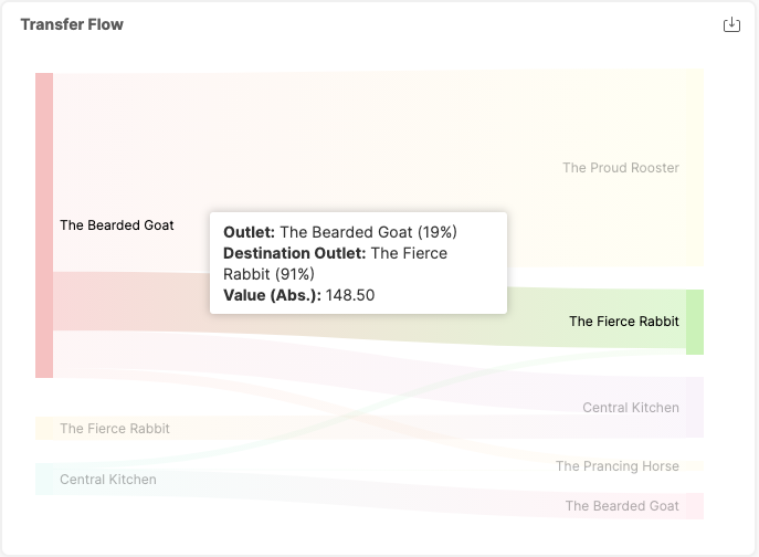
- Transfer Flow: This graph shows every transfer flow from the sending outlet on the left, to the receiving outlet on the right. Hovering over a specific flow shows you the details (sending outlet, receiving outlet, and transferred value).
- In this example we selected the flow from "The Bearded Goat" to "The Fierce Rabbit" and we see that 148.50€ was transferred. This was good for 19% of all the transfers that came from "Bearded goat" and 91% of the transfers going into "The Fierce Rabbit".
- In this example we selected the flow from "The Bearded Goat" to "The Fierce Rabbit" and we see that 148.50€ was transferred. This was good for 19% of all the transfers that came from "Bearded goat" and 91% of the transfers going into "The Fierce Rabbit".
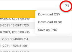
In the upper right-hand corner of every graph or table, you see an export button when you hover over the graph/table. Click this to export the specific graph or table in a CSV, XSLSX or PNG file.